(Overview)
Nomadic brought us in to set the initial visual direction for Resident Evil: Requiem. The brief covered the type treatment, the composition of stills and footage, and how motion and editing could build up to a call to action.
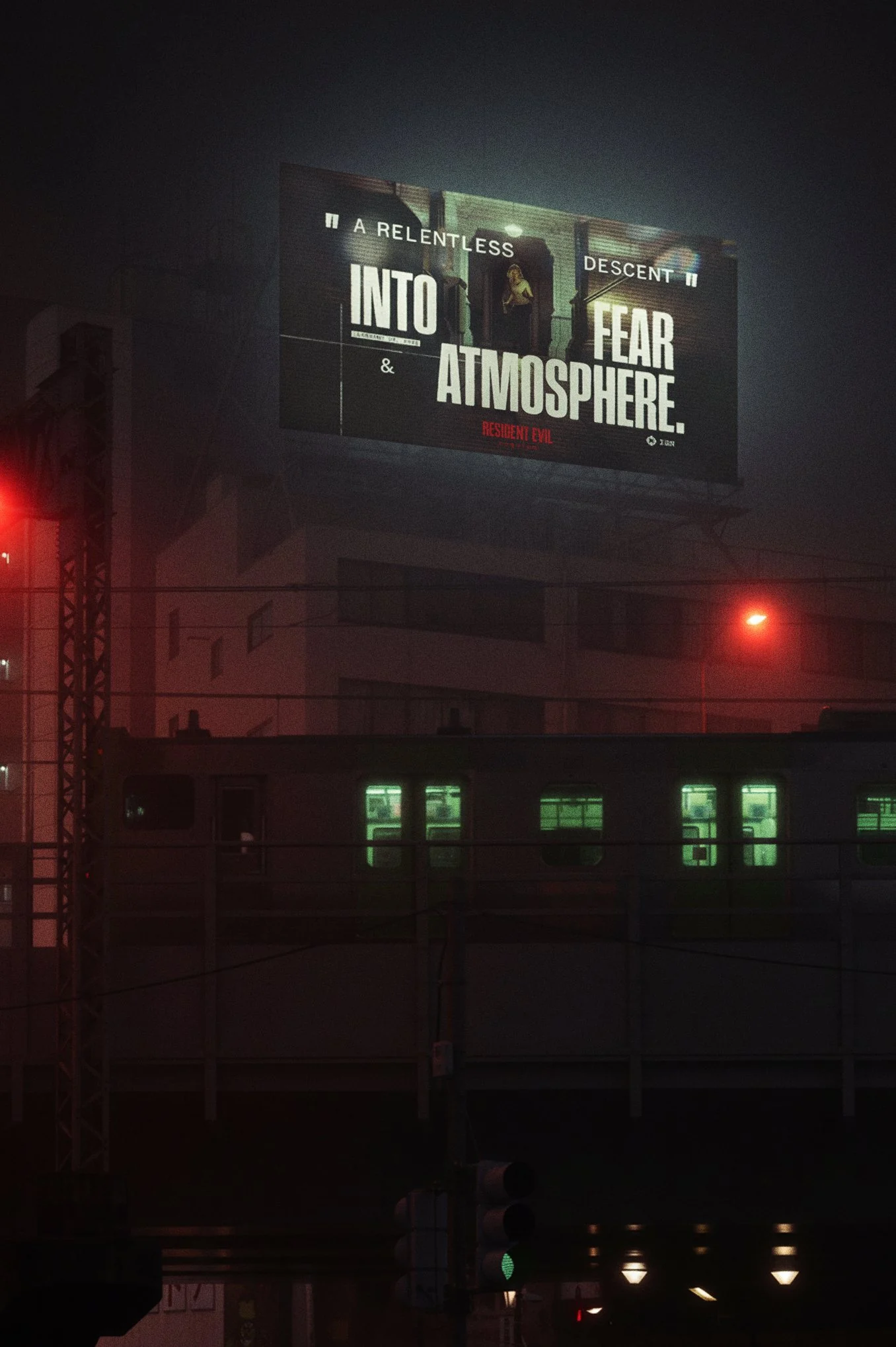
Nomadic’s team used those first posters and test edits to build the wider campaign, from social posts to billboards in Times Square.
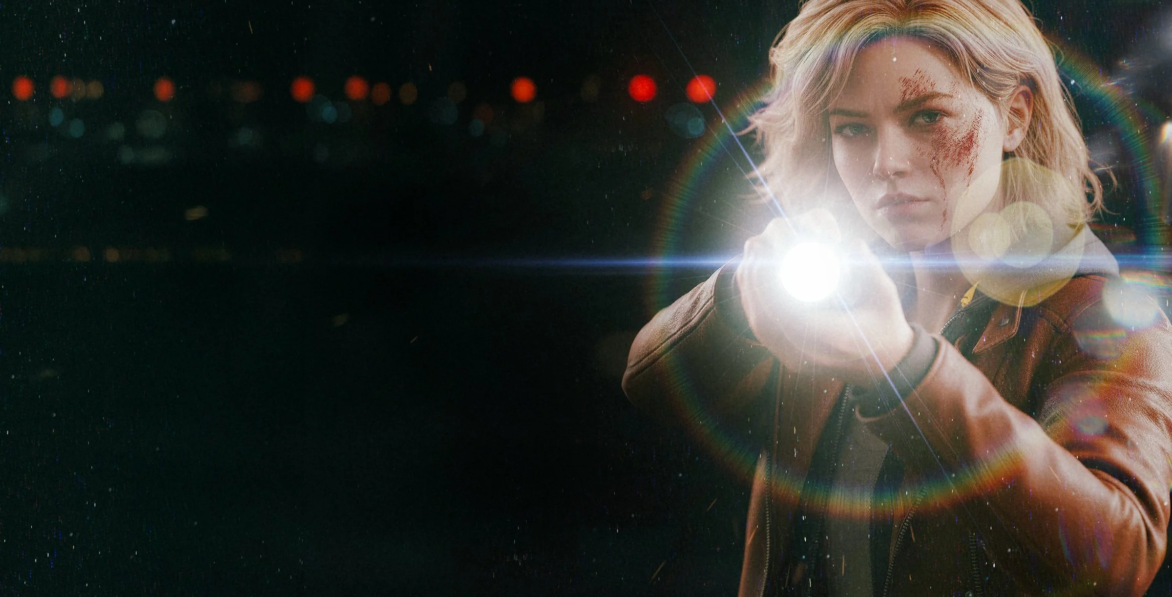
(01 — Concept)
We wanted the dread to set in while people were still looking for the threat. A single flare gave us enough light to see the survivor and enough darkness to wonder what else was out there.
(02 — Found footage)
We cut the early clips like recovered security footage. Holding on a nearly empty frame gave people time to search it. Those edits set a reference for Nomadic’s team on when to let a shot run and when to cut to the call to action.
(03 — Evil has a name)
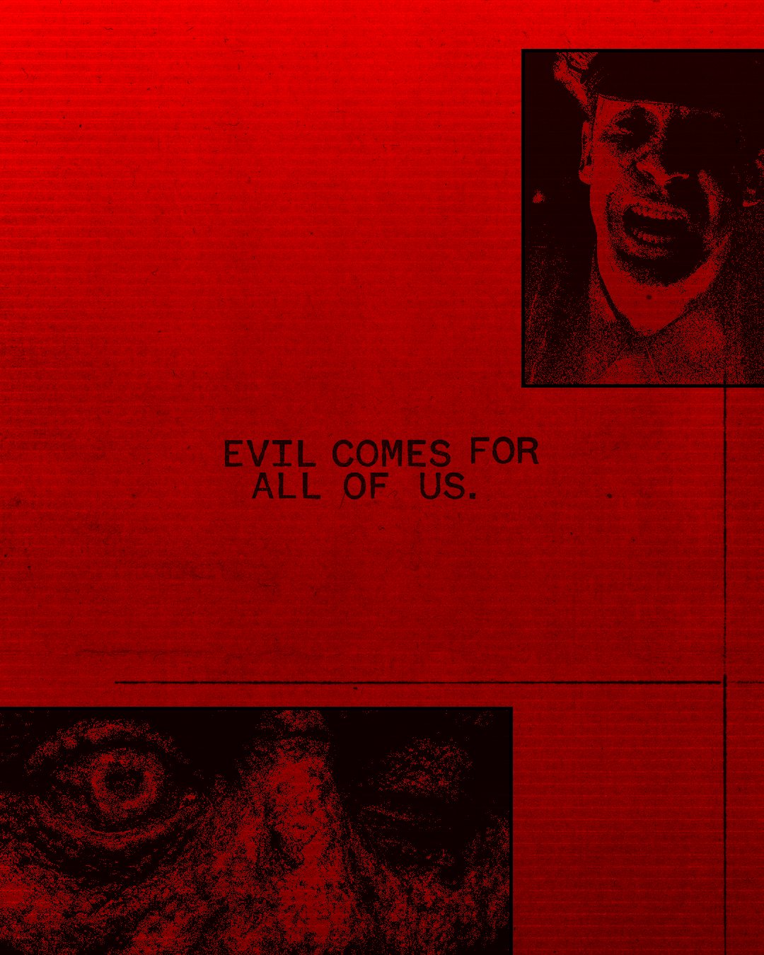
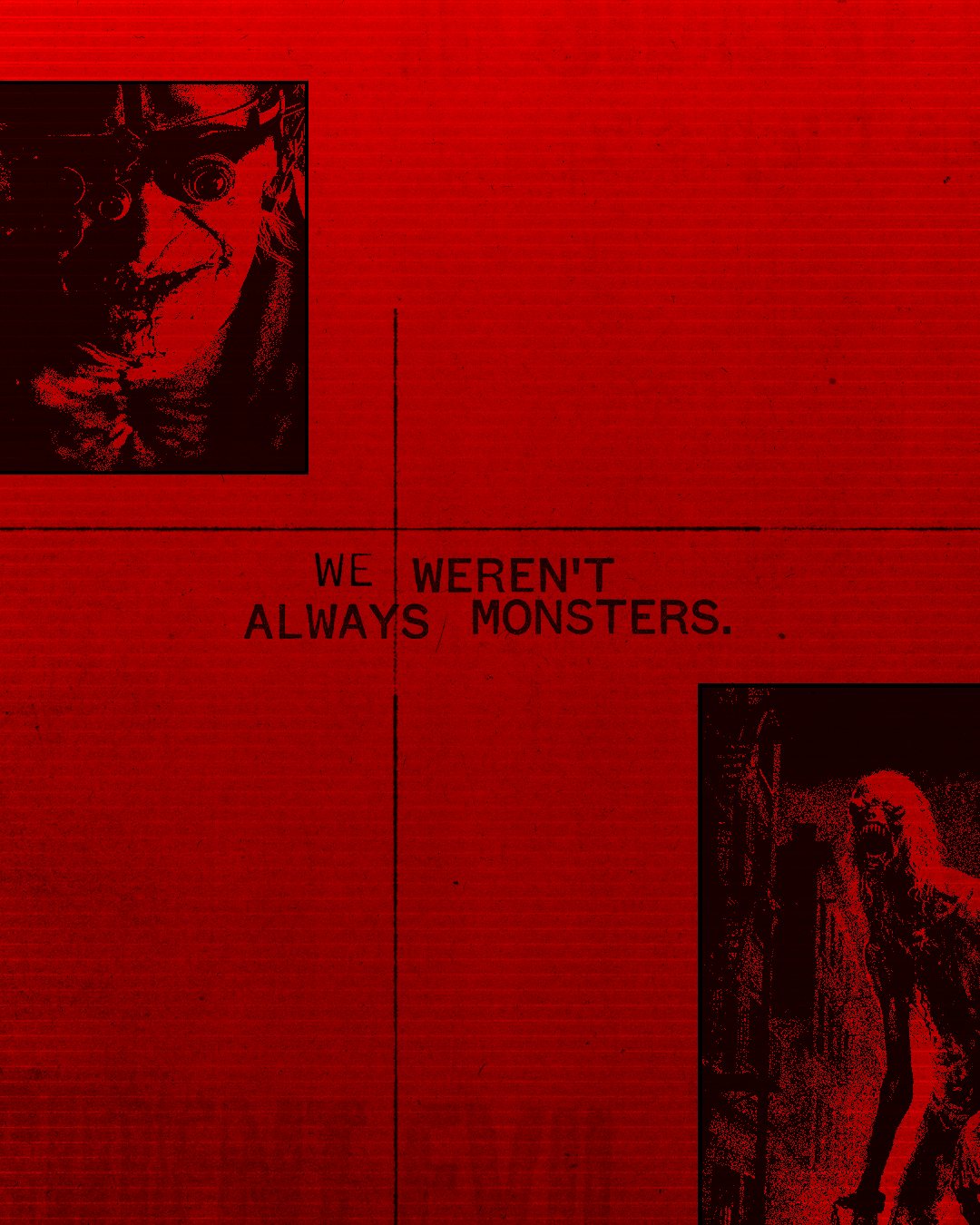
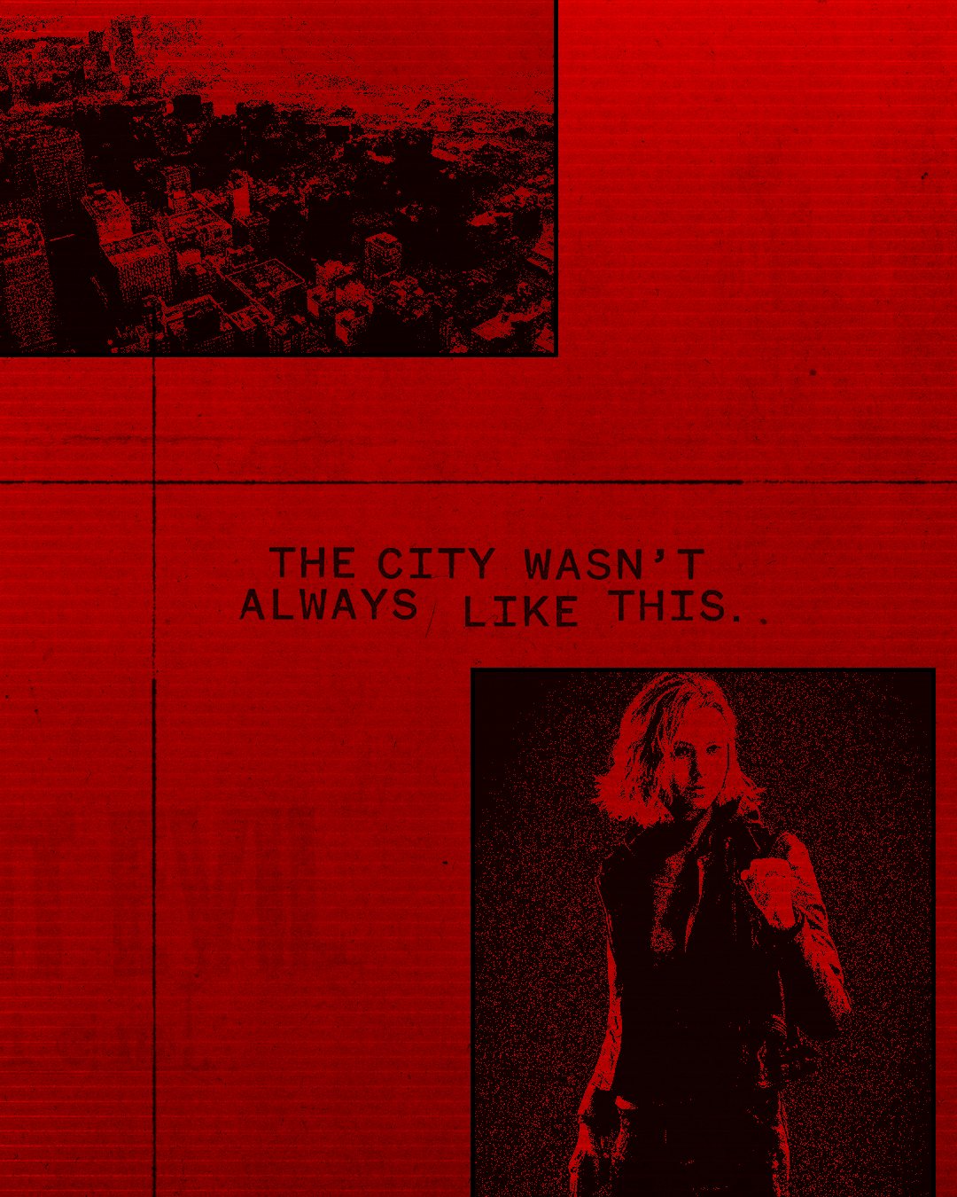
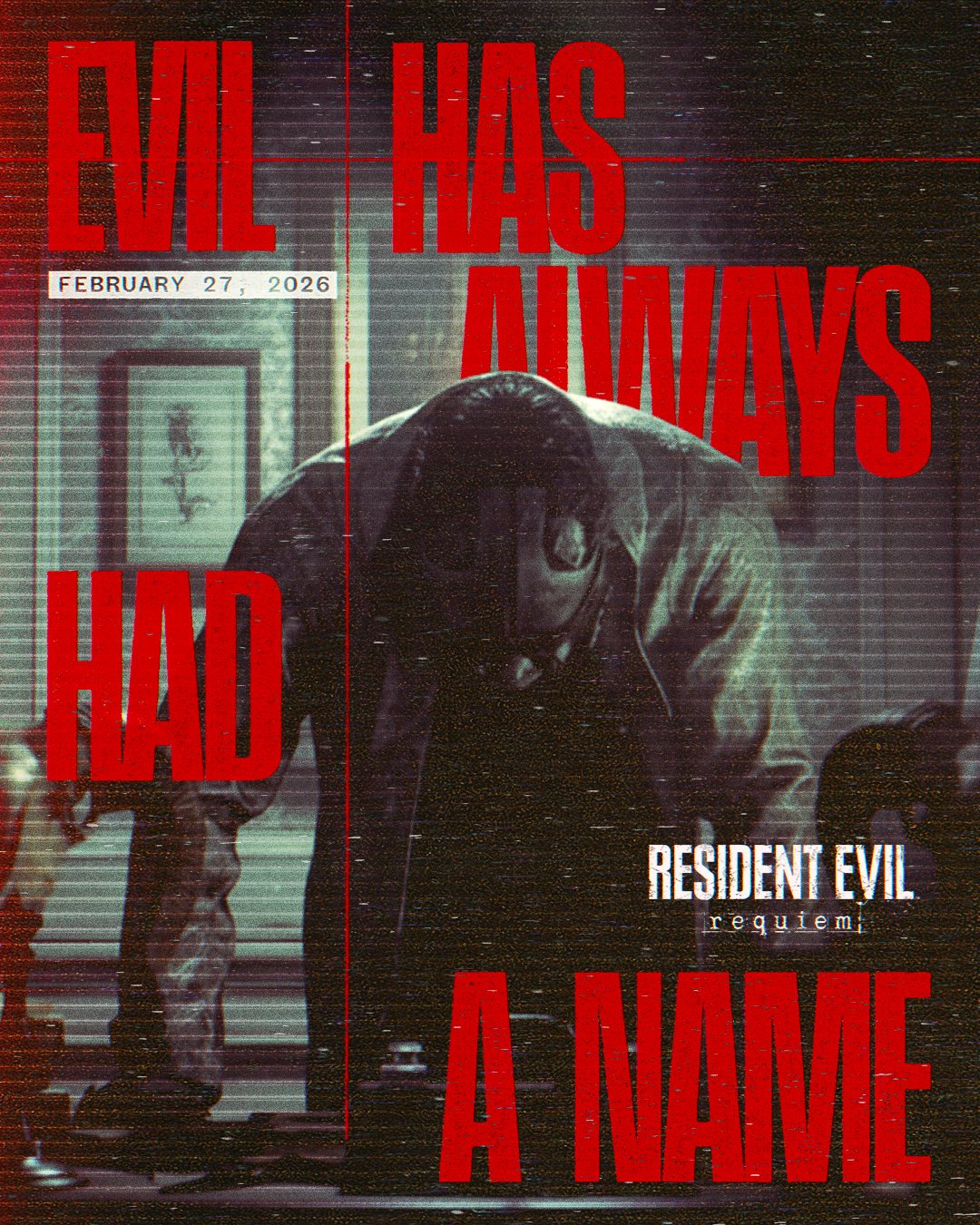
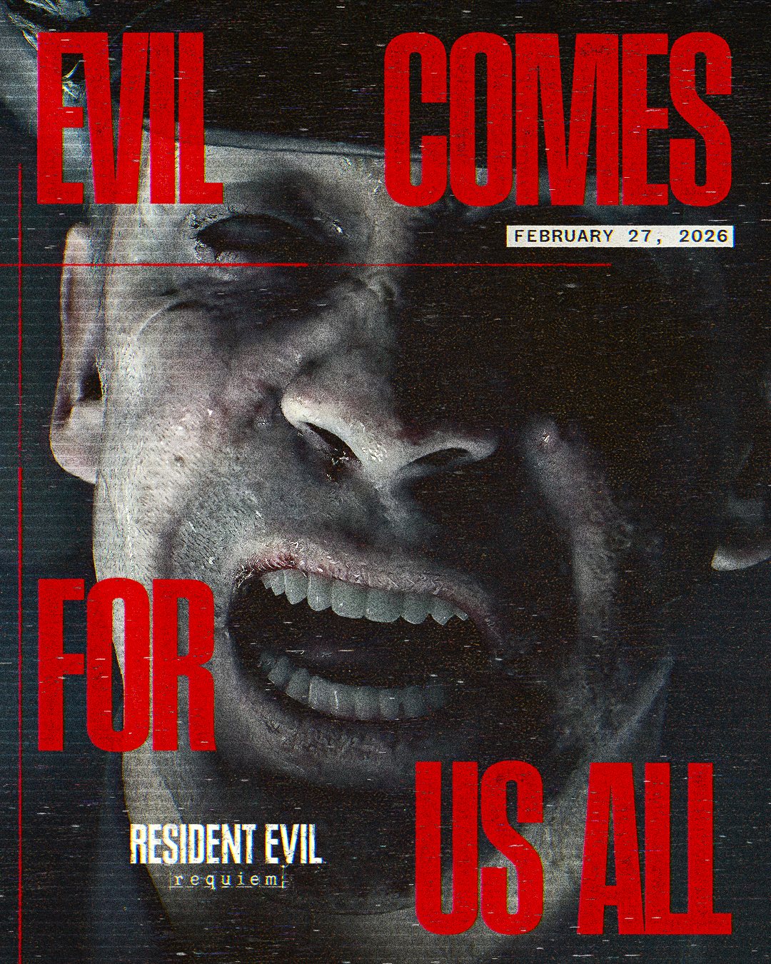
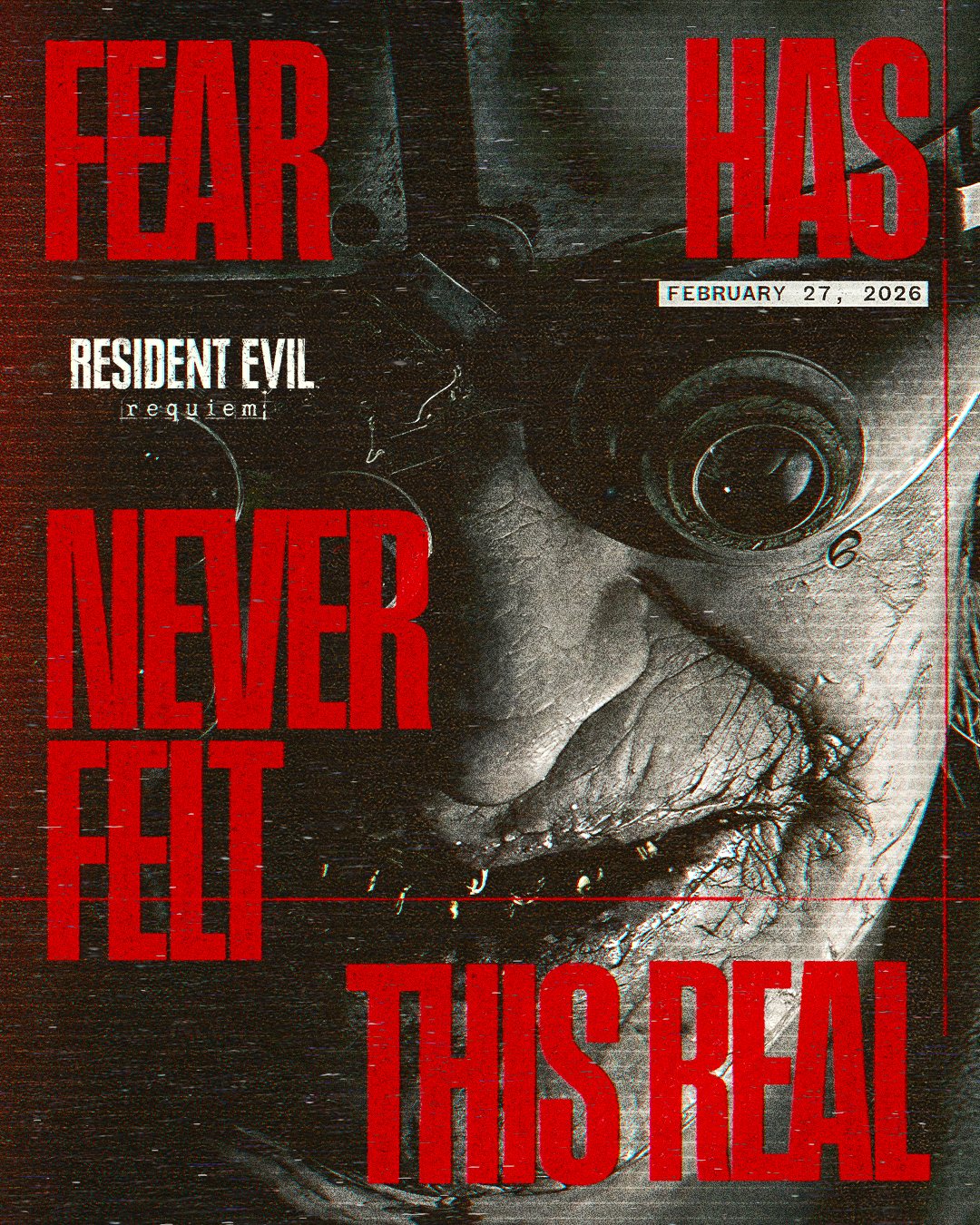
“Evil has always had a name” was the starting point. We borrowed the rough ink of old comics and the dithered shadows of early games, reducing each image to two tones. Oversized type and a hit of red turned the line into a warning you could read in a quick cut or from across the street. Drag the pieces to explore the set.
(04 — Out of home)
Out of home carried the line into the world: kiosks, billboards, and a takeover keyed to the QR drop.
(05 — Acclaim)
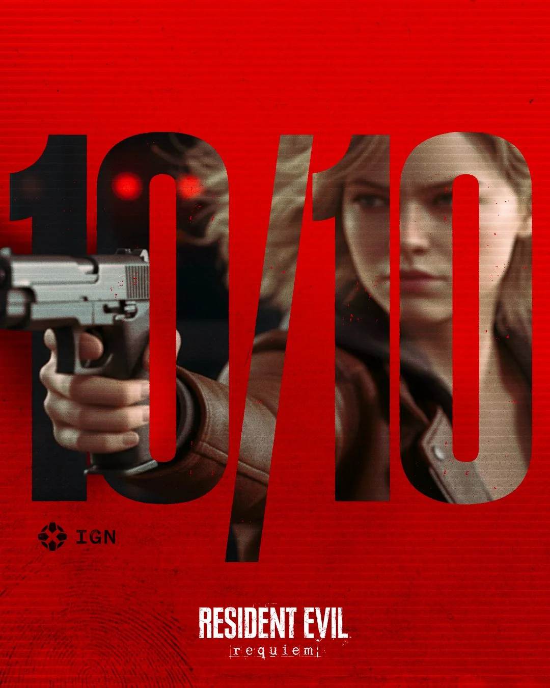
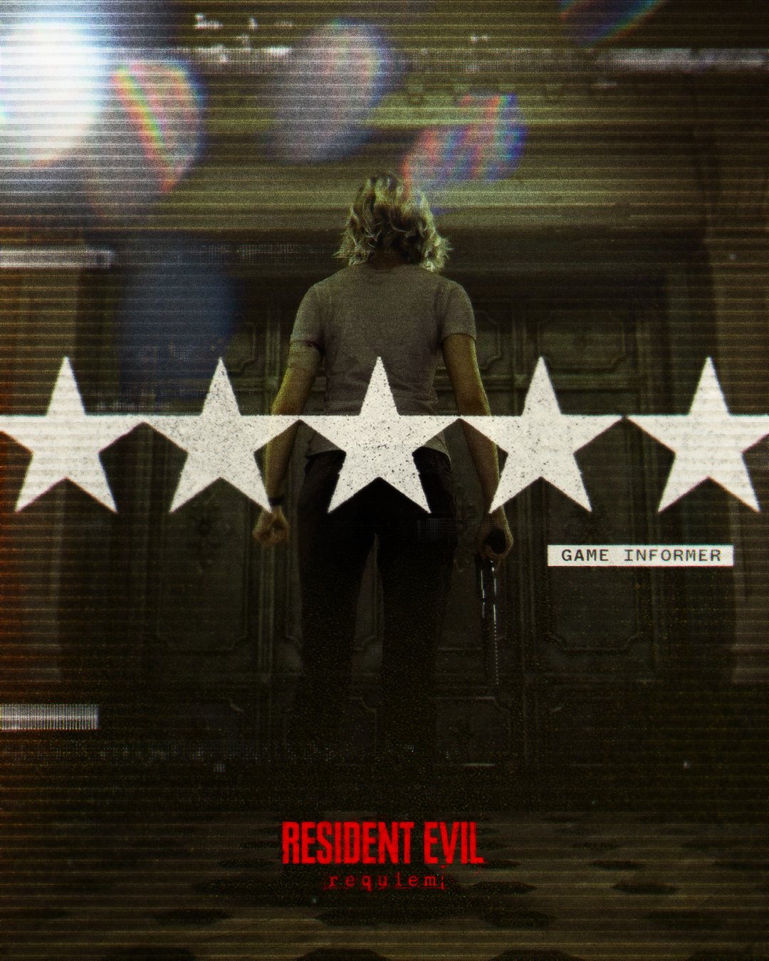
At launch the scores landed, pulled straight into the press wave: a 10/10, five stars, and a billboard built from the verdict.